Comic books have been on the decline now for years. If we take a look at the total paid circulation for one of the best-selling superhero books of all time, The Amazing Spider-Man, the sales from 1966 to 1969 averaged around 350,000 books per month. In the 70s and 80s, the books popularly was still good, but average sales were around 280,000 per month.
In 1997 to 2008, the average paid circulation was around 120,000 per month. It's not even close to what it was. Why is this? By the way, the source for the sale data is found here: http://www.comichron.com/titlespotlights.html
One of the reasons is that many Marvel and DC Comics don't get listed for sale in what was normal channels when I was a kid (back in the 1970s and 1980s). If you visit a 7-Eleven or your local supermarket, there aren't any comic books for sale, and if they are for sale, they are few and far between.
Prices have also skyrocketed - booked in the 1980s were anywhere from 25 cents to $1.00. Double-sized issues were sometimes $1.50. Nowadays, the minimum for a comic book is $3.99 US and some larger issues are $5.99 US! Yikes that is a lot of money for 20 minutes' worth of entertaining.
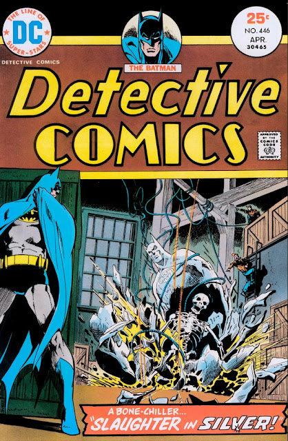
It's kind of sad because comic books were a big part of my youth and there are entire generations of kids growing up not reading anything—books, comics or anything. Anyway, that is a separate rant. I want to talk about the actual artwork. In my opinion (and that is all this is, just one man's grumpy old opinion), the Bronze Age artwork is phenomenal. The Bronze Age is generally accepted to be from 1970 to 1985. Check out Jim Aparo's Batman:
The Detective Comics logo, the title at the bottom, just brilliant!
Jim Aparo can make even Batman sitting at a desk talking on the phone exciting!
What I love about Batman's look in the 1970s is that he looks "real"—he is a human being, proportioned like an Olympic athlete, but still a human being, and is consistently drawn. Fantastic.
Compare that to more modern comics, such as the cover to Batman #671:
While the artwork (the actual pencils) are pretty good, I am not a fan of the super-thin inking, the logo being almost completely covered, and especially the computerized coloring. Again, this is just personal preference. This cover is actually pretty good. But I like the old style better.
Another example, this time the exact same artist old-versus-new: John Romita. His work on Amazing Spider-Man is legendary. Here are a couple of examples:
And of course, the greatest Romita of all:
Now let's compare the above examples to Amazing Spider-Man #600 (variant) which came out in 2009, about 35 years later:
I think that J. Jonah Jameson looks, well, cartoony. They all do. Spidey looks like he's part of a Saturday-morning cartoon show or something. Is it the coloring? Is it the inking? Is it Robbie Robertson no longer puffing on a pipe? I don't know. Again, this isn't a slam against John Romita—I LOOOOOVE John Romita's stuff. I just think the modern-day artwork is not as good as the 1970s stuff.
Artwork (and the production values) change over time, and also styles change—what is popular these days is not necessarily what was popular back in the 1970s. I personally think that 1950s comic books don't have great artwork—there is a certain charm to a 1950s Batman comic, but I don't find it greatly appealing in any way.
Maybe 40 years from now someone will be ranting about how their space comics are not as good as the 2015 comics from yesteryear. Hopefully comics will still be around for that debate to take place!


